PaceMatch +
Runkeeper is a popular GPS fitness-tracking app for iOS and Android that tracks fitness activities such as walking, running and cycling by using the device's GPS sensor. While exercising, Runkeeper also provides users with different options of listening to music directly through the app.
ROLE
UI/UX designer, UX researcher
DURATION
November 2020 - December 2020
Nowadays, runners who like to listen to music through Spotify have unlimited playlist options, which is great. Until it isn’t, because not all songs match the runner’s pace, even though they might perfectly fit the chosen genre. As a result, runners get distracted and have to switch over on the go, which is not always that easy to do.
Overview
Problem
Runners often have to switch over songs that don’t match their pace
Solution
Creating a feature that not only builds playlists but also matches music with user’s pace while running
To help users on the go to listen more while tapping less
GOAL
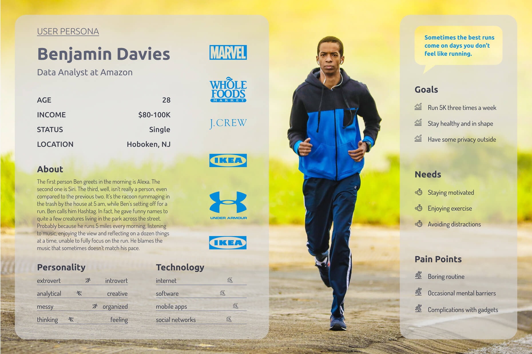
For this project, I decided to conduct a survey because I already new some information about Runkeeper users from Reddit, where, in fact, I recruited participants for my survey. It already proved to be super useful to do research purely online, so that everybody can stay safe during the pandemic. On this project, I interviewed 5 participants, 30-40 years old, male and female, living in New York City.
Research
According to the data I found, 100% of participants listen to music while running. 20% listen to custom playlists. 80% use a smartwatch and a phone for running. 40% skips at least 10 songs they don’t like during a work-out. 20% finish strong when they get the right song at the right time. 100% always listen to a mix of genres.
KEY FINDINGS
Pain Point #1
Lots of runners like challenges. They play with distance and intensity, slow downs and accelerations, and the right music is a huge booster for that. But, unfortunately, there’s no way every single song on the playlist will hit the spot, right?
We’ll give users two options with the feature. The 1st one will pick songs by tracking users’ pace, and the 2nd one will provide them with a choice of pre-set paces.
We’ll give users two options with the feature. The 1st one will pick songs by tracking users’ pace, and the 2nd one will provide them with a choice of pre-set paces.
Pain Point #2
Running is usually monotone. One might even say boring. Switching between two apps on the go adds a bit of whimsy to the routine but doesn’t make it enjoyable.
We are going to add some basic music player buttons to Runkeeper, so that users don’t have to switch back and forth between Runkeeper and Spotify when their phones are unlocked.
We are going to add some basic music player buttons to Runkeeper, so that users don’t have to switch back and forth between Runkeeper and Spotify when their phones are unlocked.
Pain Point #3
Some songs start great but continue not so much. Some do the other way round. And some just don’t work at all, and when you hear it for the first time, you don’t know if you have to wait for the song to kick in or fast forward or just skip.
We should take this into account when selecting tracks for our feature and not include songs that have drastic beat changes.
We should take this into account when selecting tracks for our feature and not include songs that have drastic beat changes.
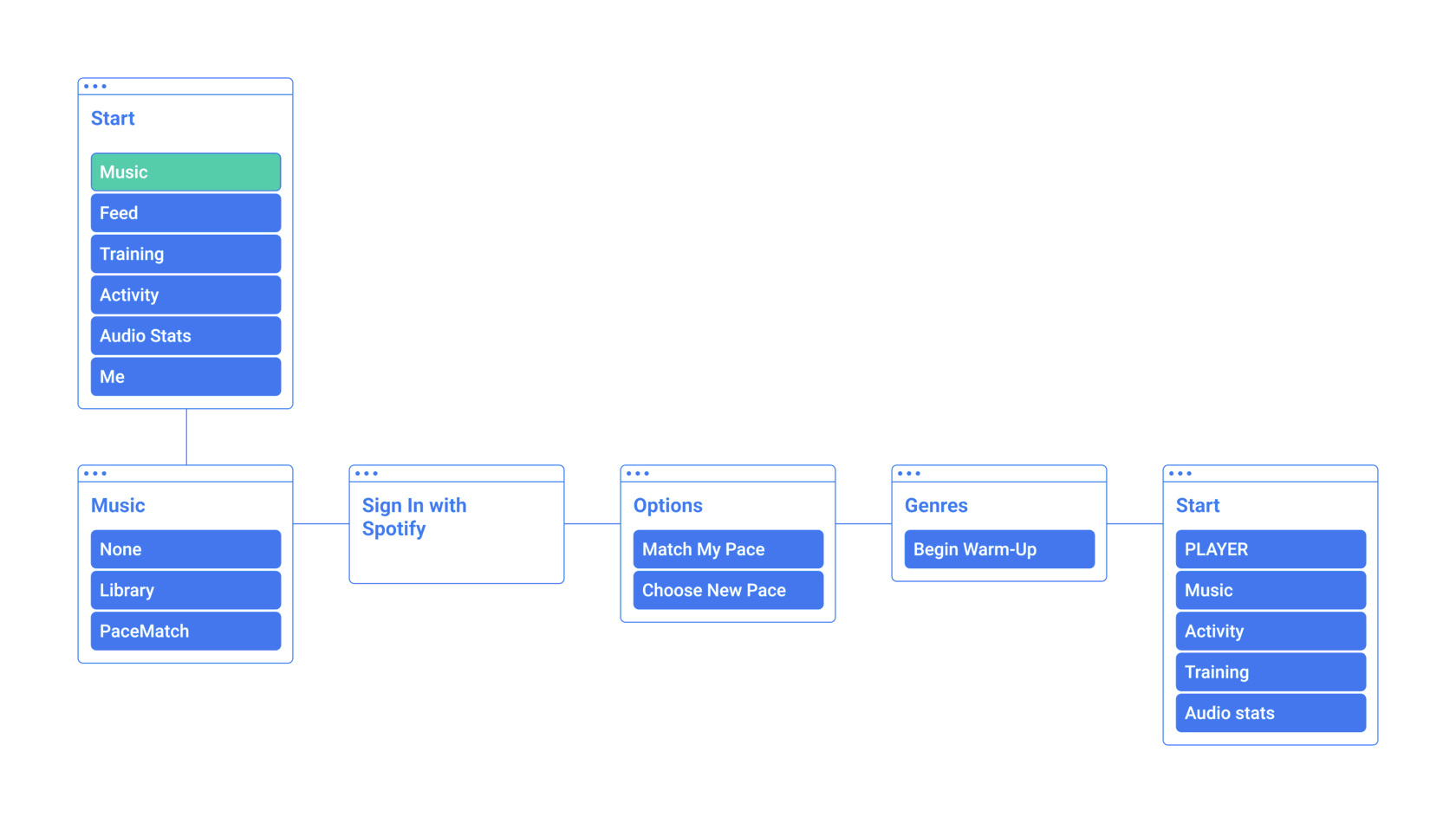
Sitemap
Integrating a feature into an already popular app is a challenge in itself. Luckily, Runkeeper already had ‘music’ on the menu, so I didn’t have to reinvent the wheel.
Wireframes
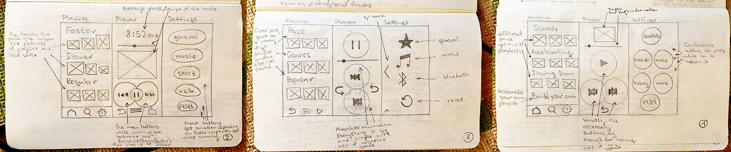
Before sketching out my ideas, I decided to explore deeper into the design of the two apps, Runkeeper and Spotify, in order to create something that would have the best from both of them.
The problem was, I immediately discovered that I was creating a kind of Frankenstein-feature that stood out too much. To tackle that I decided to stick with Runkeeper’s style and guidelines and design a brand new player navigation that would be focused solely on runners, with a small play/pause button and large skip buttons.
As I decided to stick with the original Runkeeper app there was no need to create low-fidelity so I jumped right into medium-fidelity.
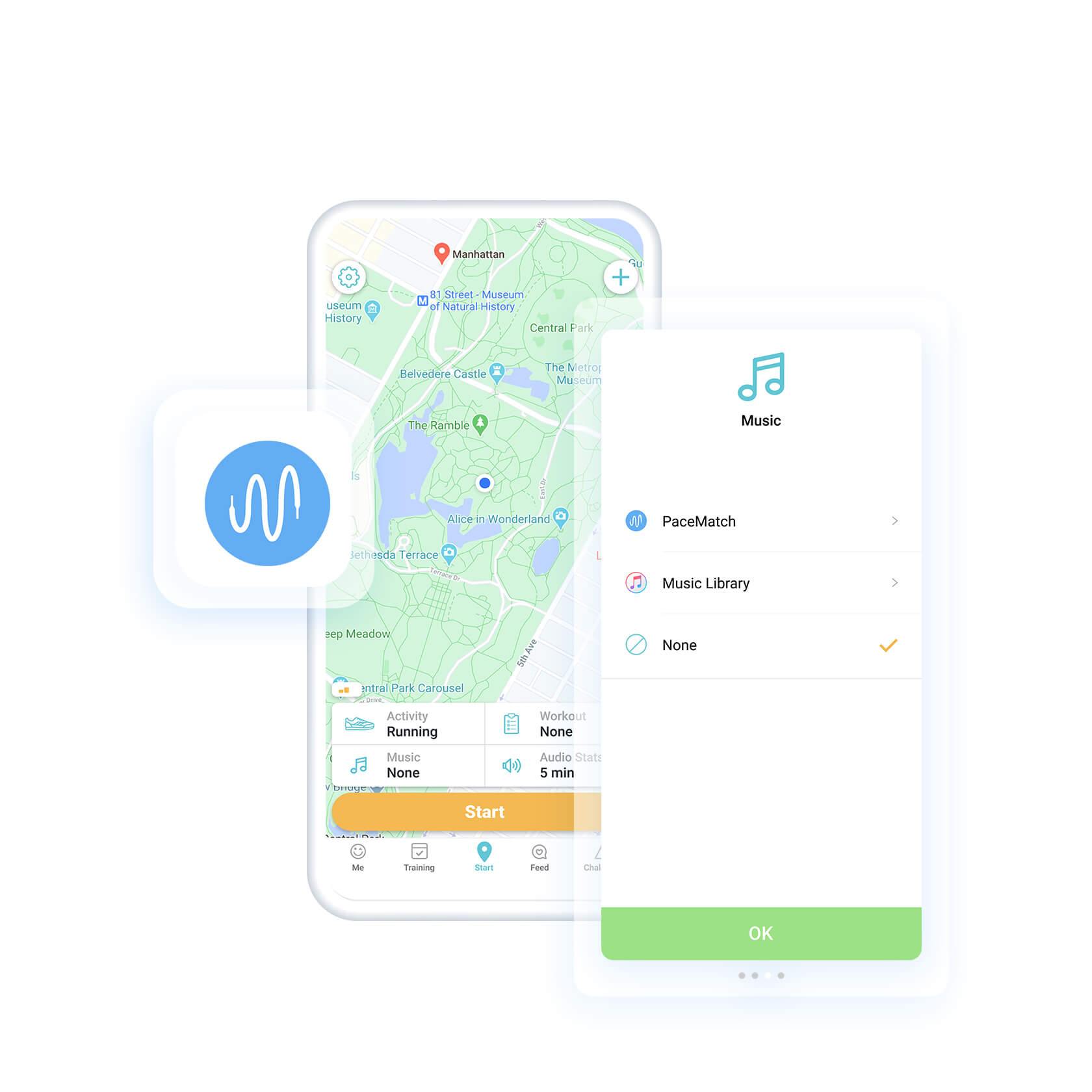
Medium-fidelity mockups
As for this project I needed only to tackle music player to introduce the new feature, creating medium-fidelity mockups was a breeze. I added a couple of new screens to sign in to Spotify and introduced the pace feature inside the current music player.


Usability Study
To test my prototype, I sent out the link to the participants of my research. Overall, it took them less than two minute to finish the task. After the testing was completed, they shared their thoughts with me.
- the feature screen is not completely self-explanatory
- the options screen should contain more details about the actual options
- the drop-down player is too small
- the options screen should contain more details about the actual options
- the drop-down player is too small
KEY FINDINGS
High-fidelity Mockups
All in all, the design of the feature turned out very simple and clear, which is exactly what my goal was because, as we remember from my research findings, runners don’t like being distracted or doing too much screen tapping to set up for a work out.
The biggest challenge here is definitely the player and its place and layout. On the home screen it is still too small to navigate properly. But, on the other hand, almost no one unlocks the phone on the go while running in order to skip a song, right?
The biggest challenge here is definitely the player and its place and layout. On the home screen it is still too small to navigate properly. But, on the other hand, almost no one unlocks the phone on the go while running in order to skip a song, right?


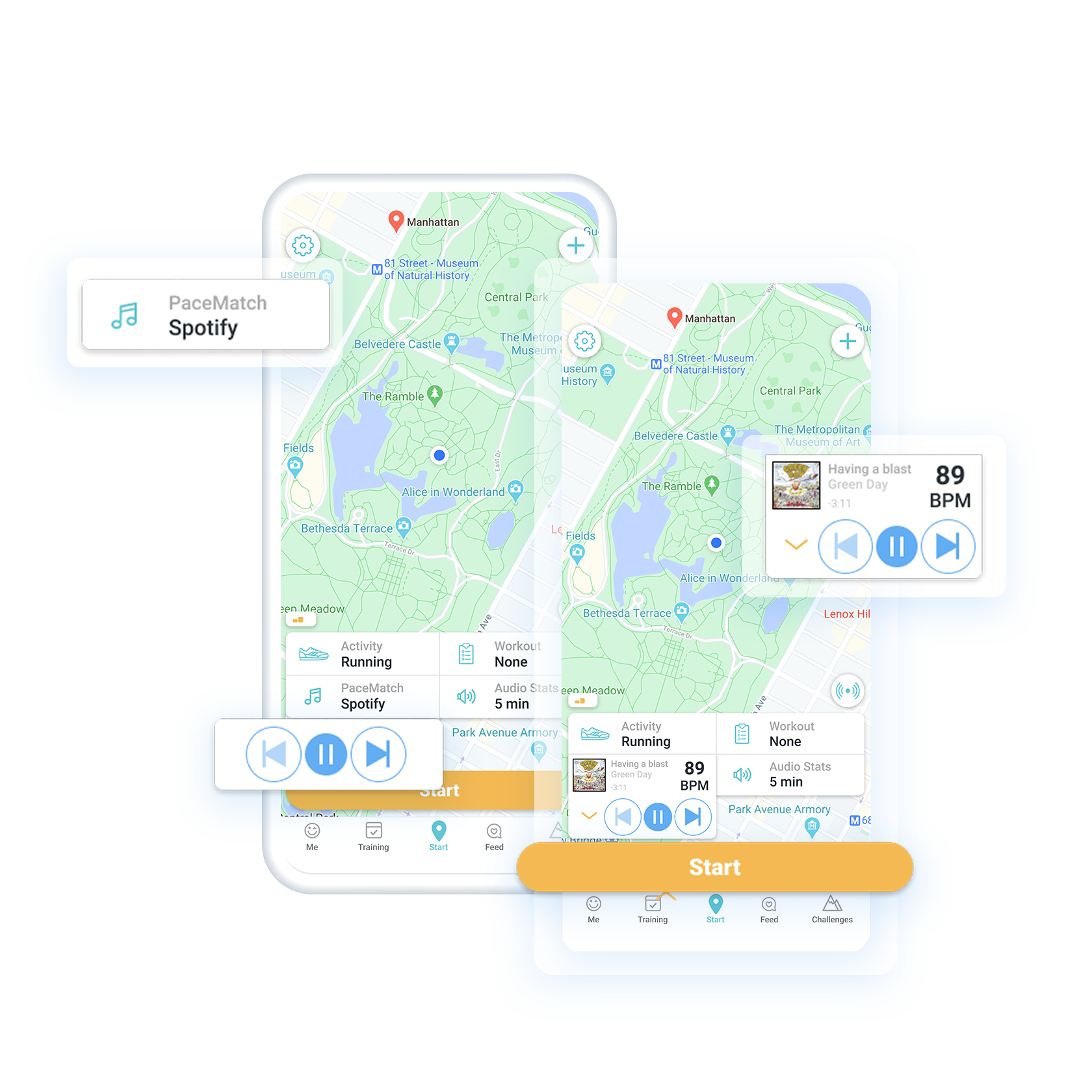
Sign in via Spotify


Pick the pace


Start running
Try it yourself
Takeaways
After all the researching, brainstorming, designing and researching again, it became absolutely clear that the feature has some potential. It is still a little raw according to the usability testing but it can evolve into something fresh.