ScreenSpire
ScreenSpire is an app that is basically a library of written scenes from existing movies and TV shows. It helps movie industry professionals to do their writing research, enabling users to find specific scenes in particular formats and genres a lot faster than doing it manually, which is especially important for writers’ rooms of TV shows where the speed of writing is essential to the process.
ROLE
UI/UX designer, UX researcher
DURATION
January 2020 - March 2020
How does a green writer feel when finally landing a dream job in a writers’ room of a TV series. Joyfull? Energized? Special? Try all that coupled with lots of pressure because now this writer has to prove that hiring them wasn’t a mistake. And the best way to do it is to write. Write really good and really fast. And then, after getting feedback, rewrite. Also really good and really fast. But what if there’s a bunch of specific scenes that the writer has never written? For instance, car chase, sex, landing on Mars, etc. Time to research how others wrote such scenes. But not too much time. So, the best bet is to focus on the best examples. Now, how does one find those fast, you’ll ask?
Overview
Problem
Researching screenplays manually takes too much time
Solution
Designing an app that helps you find the best examples of specific scenes
To make users’ writing time longer by making their research time shorter
GOAL
For research, I traditionally went online and made a long stop on reddit where they have a large screenwriting community. Problem was that screenwriters like most writers aren’t very talkative, so I didn’t manage to get a whole lot of them for my research. However, I quickly found a solution by checking out the latest lists of semifinalists at Austin Film Festival and contacting them directly. I figured that winners would be way too far-fetched and finalists would not notice my request among tons of congrats in DM. So, yeah, semifinalists were my best bet and it worked.
Research
1. When writers’ research takes too long it becomes procrastination and most often writers notice it too late. Because the vast majority of information screenwriters need is scattered all over the web, it requires a lot of time to find and organize it. Especially when it relates to other people’s writing samples.
2. There’s no one strategy for writers’ research. All screenwriters just play it by ear, navigate it in the dark, one step at a time, experiment, make mistakes and then do it again, as many times as needed, until it works.
3. All writers copy other writers. This is how this industry works. Screenwriters learn by stealing what others wrote and then making it their own with the help of rigorous editing and iterating. It’s not copy-paste though. It’s copy-make it better.
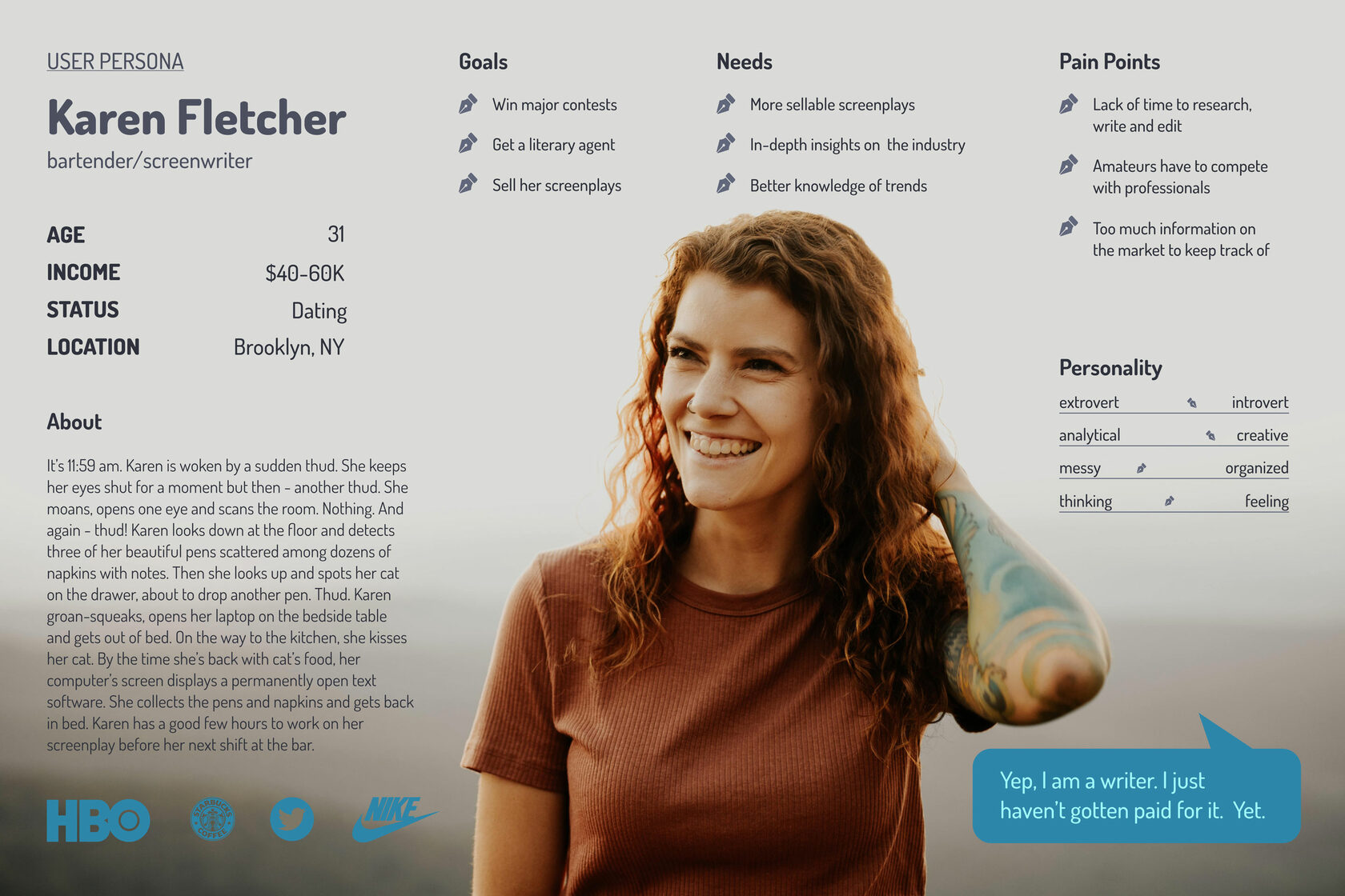
KEY FINDINGS
People have day jobs. Sometimes more than one. So, if they want to become a screenwriter, they need to skip or speed up some processes regarding their writing.
But what and how?
But what and how?
That’s right. Aspiring screenwriters don’t compete with their peers. Their rivals are pros who make money by writing and they don’t wanna yield that privilege. Yes, it’s unfair but it’s reality.
Youtube channels, classes, books, subreddits, instagram profiles and a lot of other sources screaming lessons on screenwriting if you follow them. It’s a lot of unstructured noise.
Lack of time to research, write and edit
Amateurs have to compete with professionals
Too much information on the market to keep track of
Pain Points
Sitemap
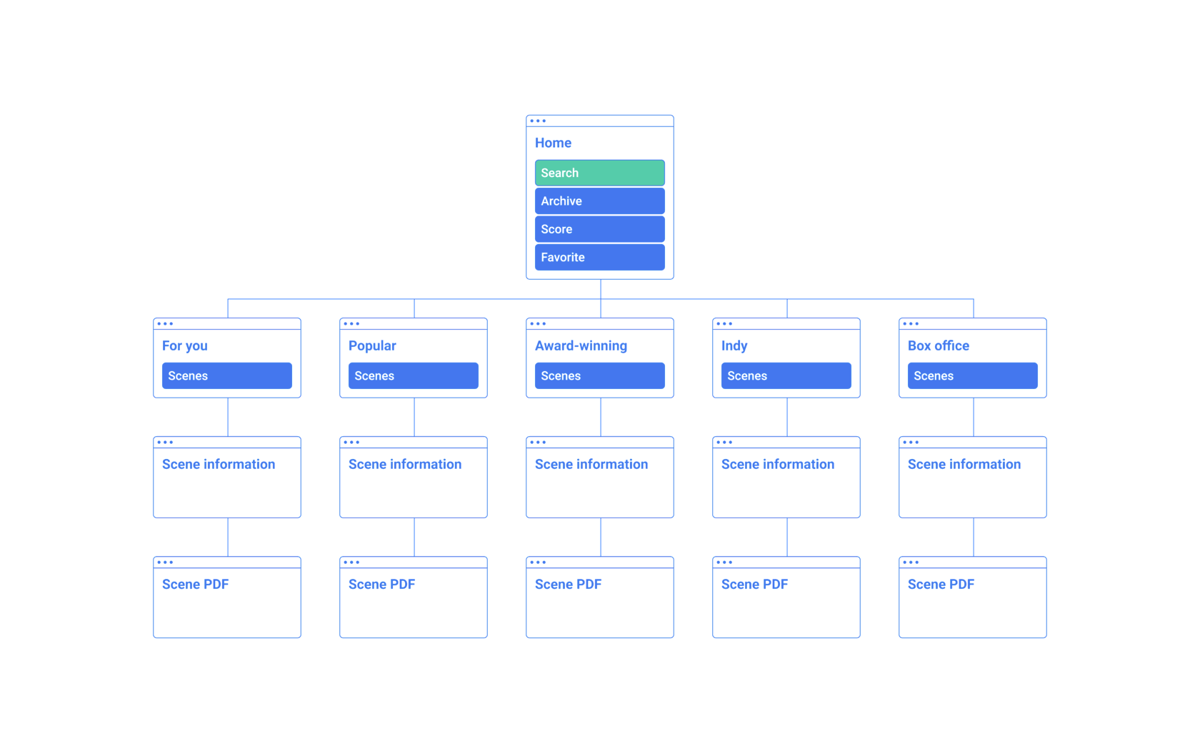
To start planning the architecture of the application and where these features would fit into it, I created a site map to organize the screens in a way that would be logical and intuitive for our user. It was important to keep the information architecture as simple and concise as possible since most of the users would use this regularly during the writing process.
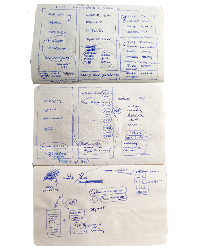
Wireframes
The most fascinating and, at the same time challenging, was the fact that no one ever made an app for screenwriters, so I didn’t have any references to start creating wireframes. To draw inspiration, I had to look at some indirect competitors, like Etsy, Argo and Spotify.

© Daniel Smith/Warner Bros. Pictures
After several drafts on the paper I had a clear idea of the architecture of the app, however, I wanted to continue to better understand how users would be interacting with the key screens and features in the app.
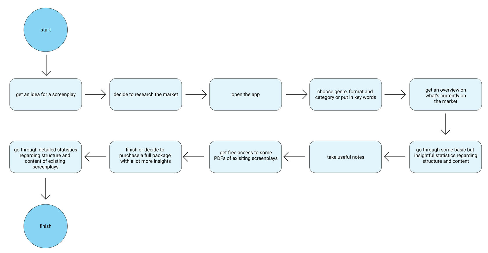
I first started by identifying what key tasks the user would be trying to complete when using Screenspire based on the users' goals. Then, I identified the specifications for the key screens I would need to design based on the site map. Using this information, I obtained before I started my process of understanding our user’s interaction with the app with task flows. These task flows helped me to see how our users would be completing these key tasks - what screens they would be interacting with and what actions they would be taking in a linear flow.
I first started by identifying what key tasks the user would be trying to complete when using Screenspire based on the users' goals. Then, I identified the specifications for the key screens I would need to design based on the site map. Using this information, I obtained before I started my process of understanding our user’s interaction with the app with task flows. These task flows helped me to see how our users would be completing these key tasks - what screens they would be interacting with and what actions they would be taking in a linear flow.
From paper to digital:
- 4 rounds of iterations
- no screenplay was harmed in the making of this app
- 4 rounds of iterations
- no screenplay was harmed in the making of this app
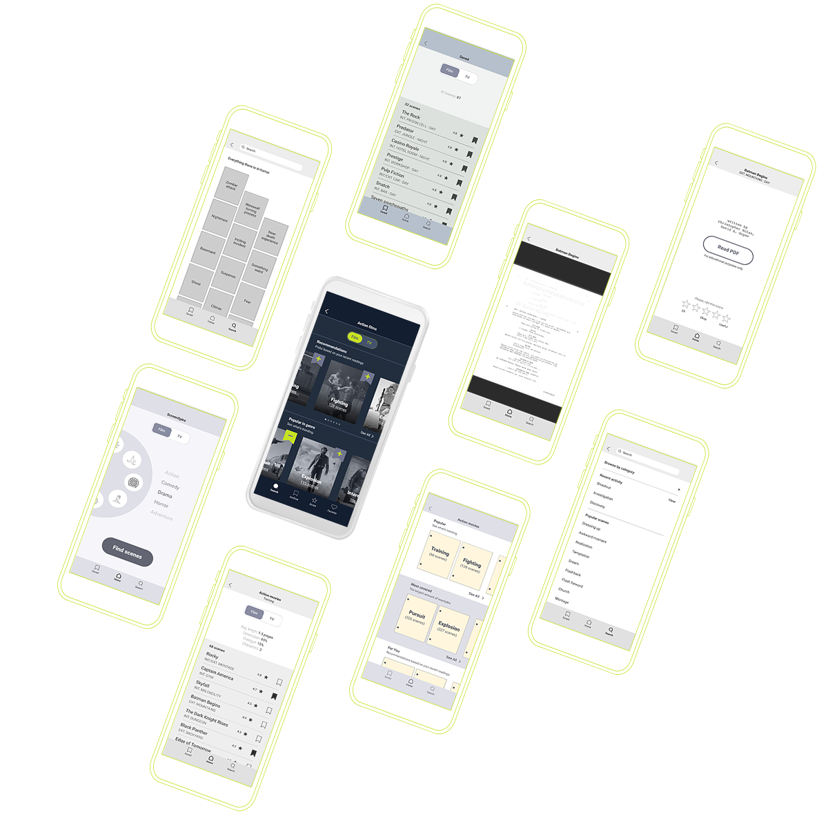
Low-fidelity mockups
I came up with a few early sketches for the app in order to determine which components worked best together.
After the first draft I realized the components should be grouped differently. I introduced the bottom menu, moved the main hero wheel to the left so it would be more accessible, Added text description to the main sections and icons.
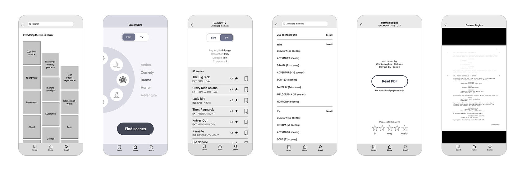
Looking at the second iteration I realized the screenplays don't look exciting for the end-users so I revamped the visuals to represent real-life experience (they put sticky notes while reading). Also introduced the group rating (instead of personal) so users could judge how helpful this abstract is. For personal bookmarks I added "love" icon.
I showed the 3rd iteration to my fellow screenwriters to gather some initial feedback. Based on their input I introduced "average length" feature so they could estimate how much time needed to read the passage. Also I was going to make the app paper-like aka white pages only (like real screenplays) my users wanted to explore dark option as it's more familiar for them from Netflix user interface. So I ended up with the dark version of the app.

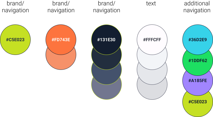
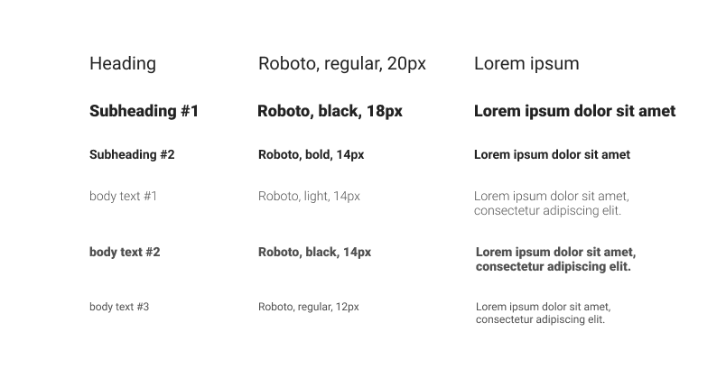
UI Kit
LOGO
COLORS
TYPOGRAPHY
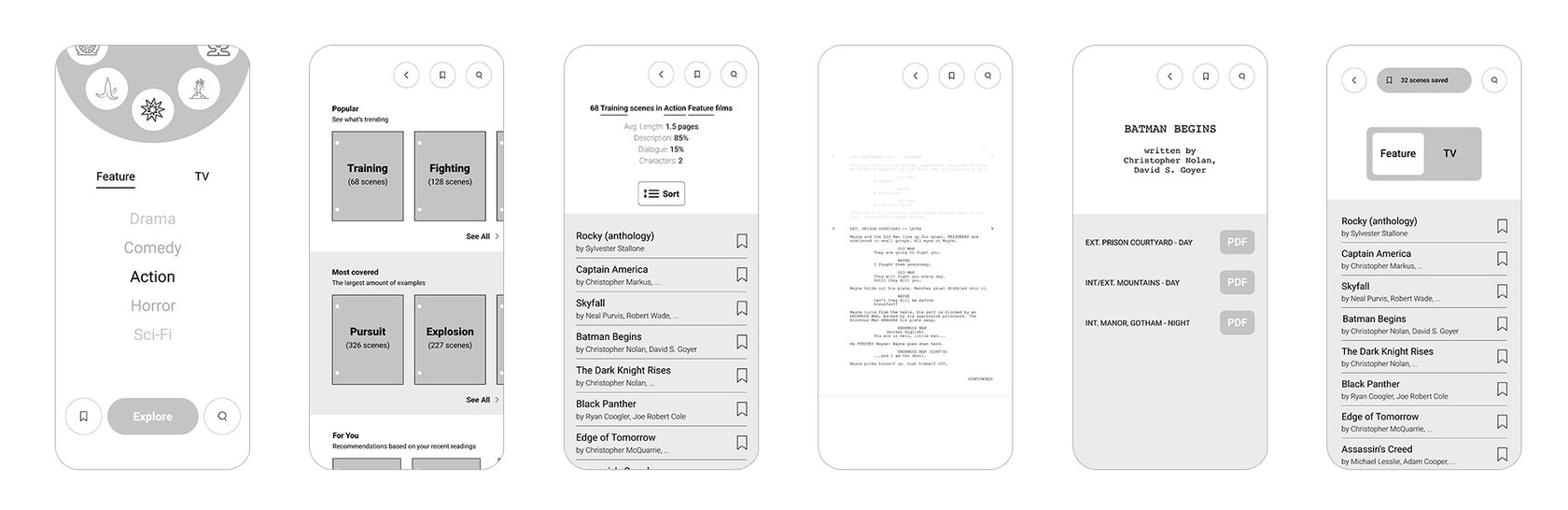
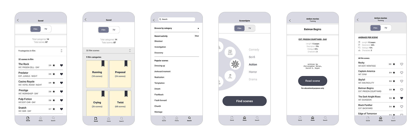
High-fidelity mockups
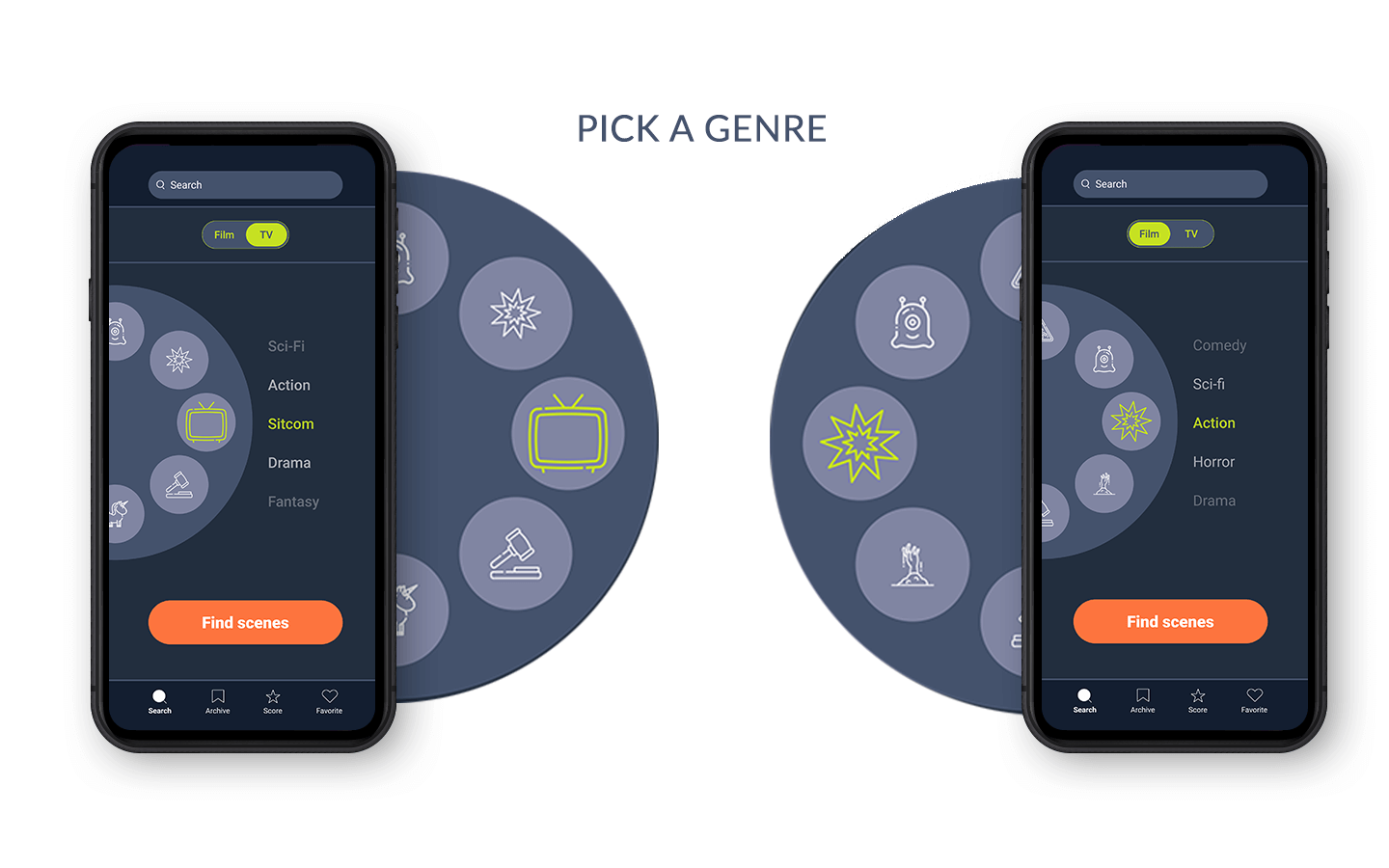
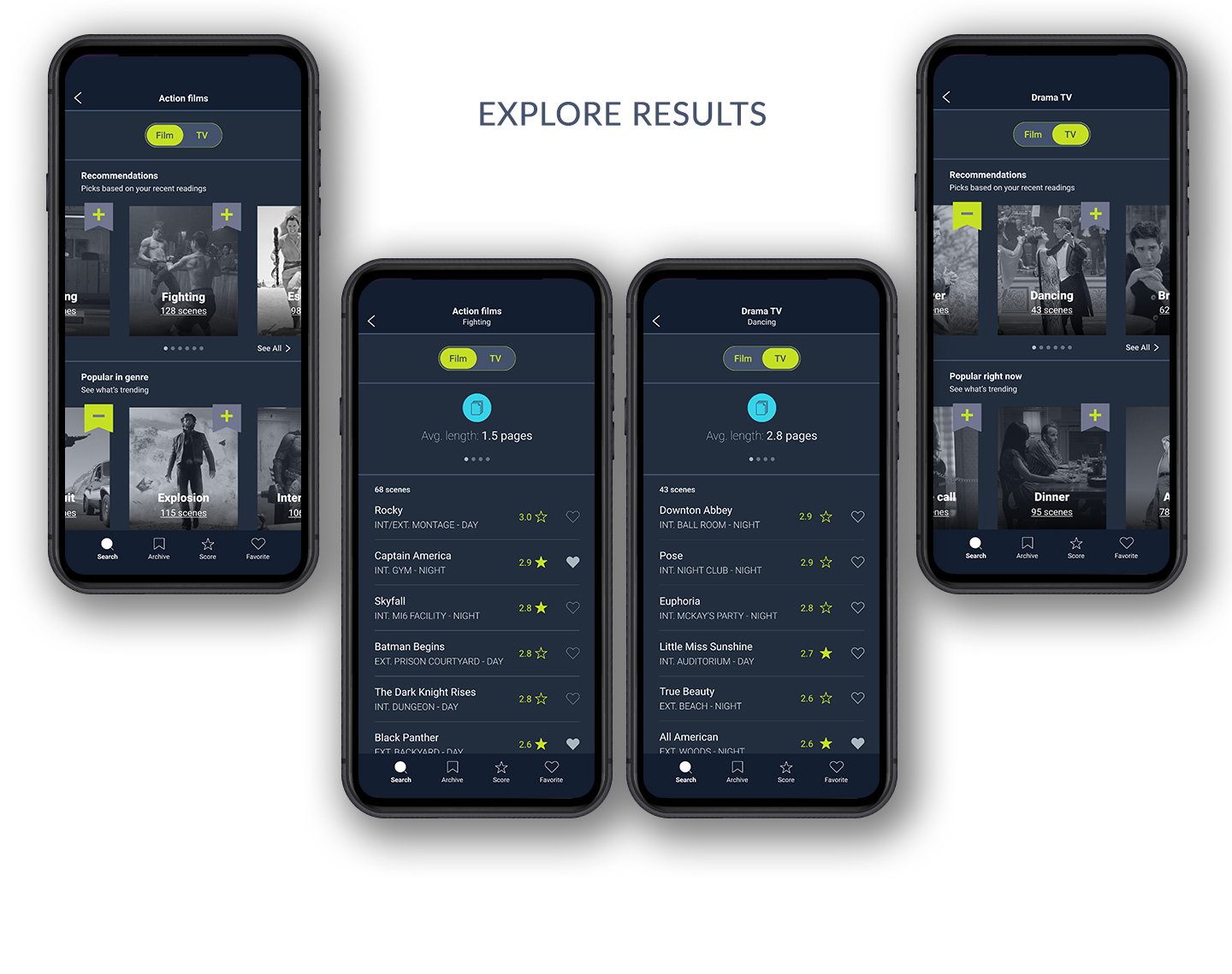
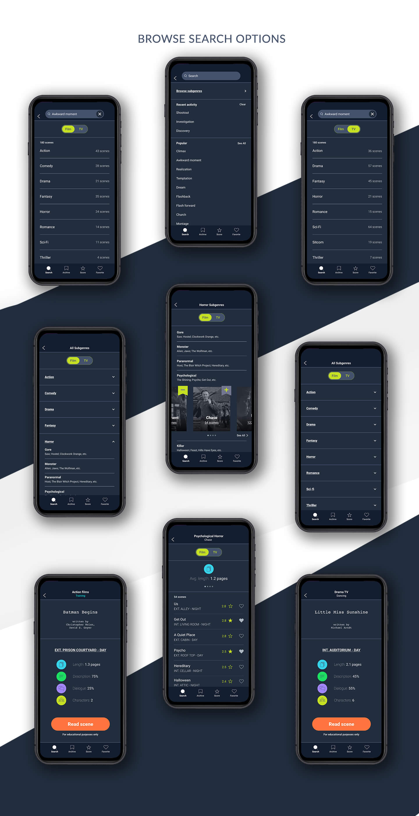
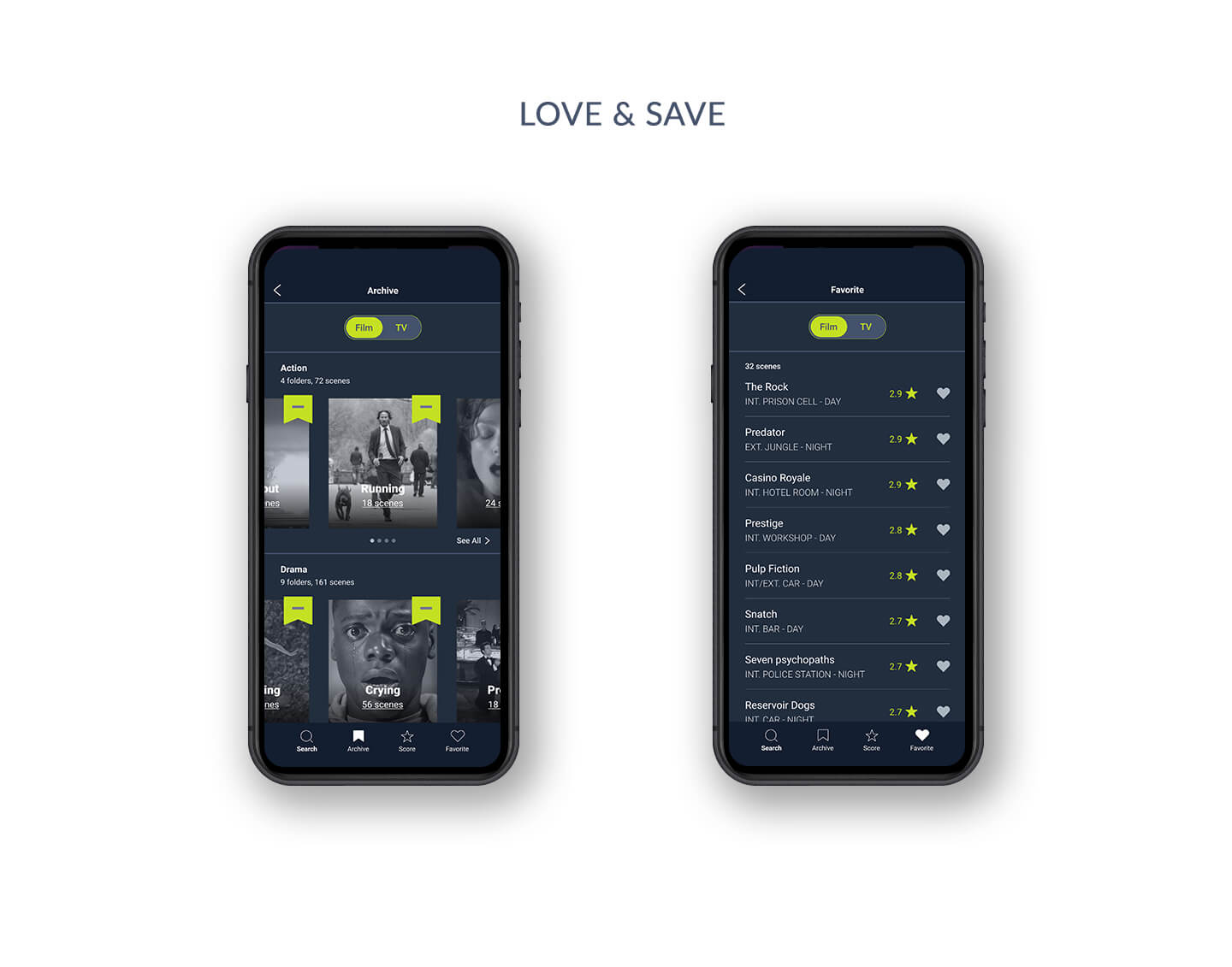
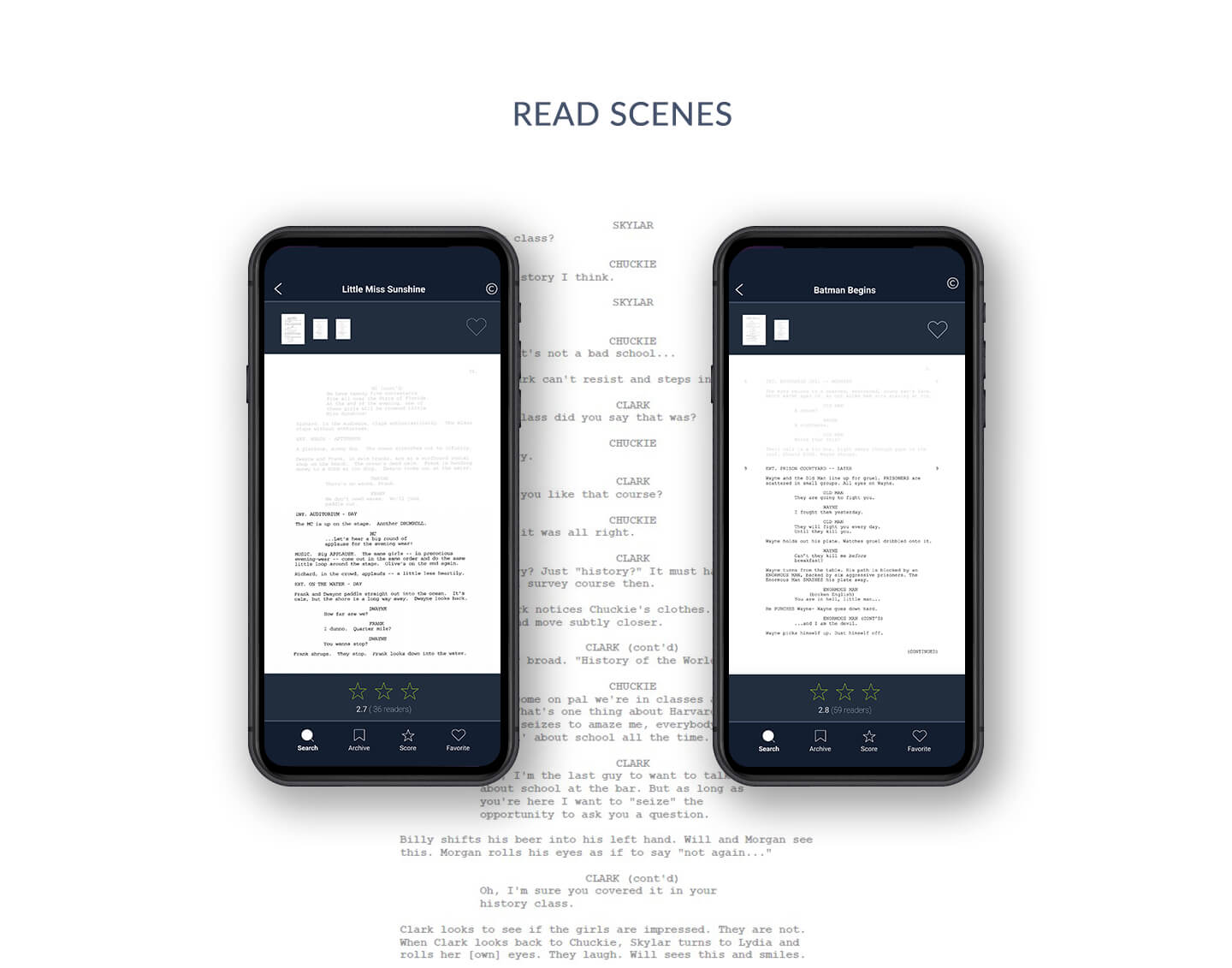
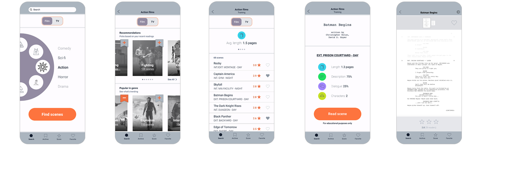
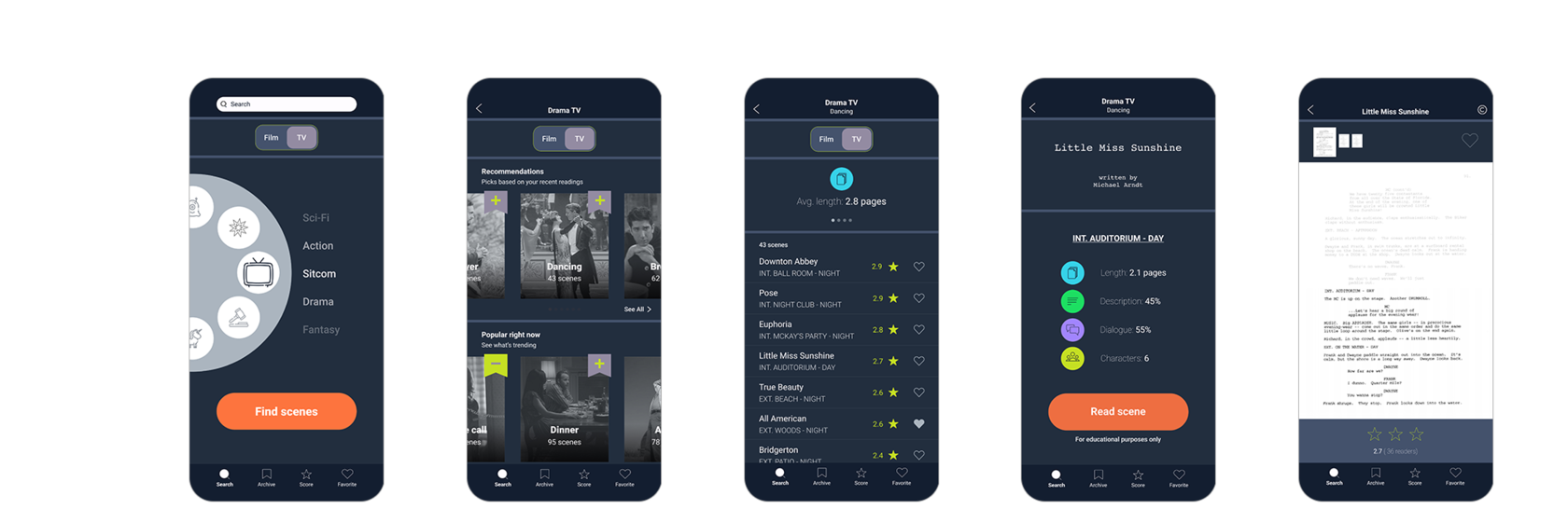
The final design has easy search navigation that was listed a plus during the interviews. I've added the opportunity not only mark favorite scripts (with the "heart" icon) but to add a whole category to favorites ("archive" icon). It's crucial for writers who work only in a couple of genres.
Takeaways
Helping both aspiring and professional screenwriters find writing samples of interest faster and more comfortably seems to be a rewarding activity. It can help us take the industry to the next level by opening a possibility to deliver more content in smaller time frames. An application like this could be useful for the armies of writers who get hired by Netflix, Apple TV and Amazon Prime, and for aspiring screenwriters who dream of placing at Austin Film Festival in order to get close to the writers’ room of the companies listed above.