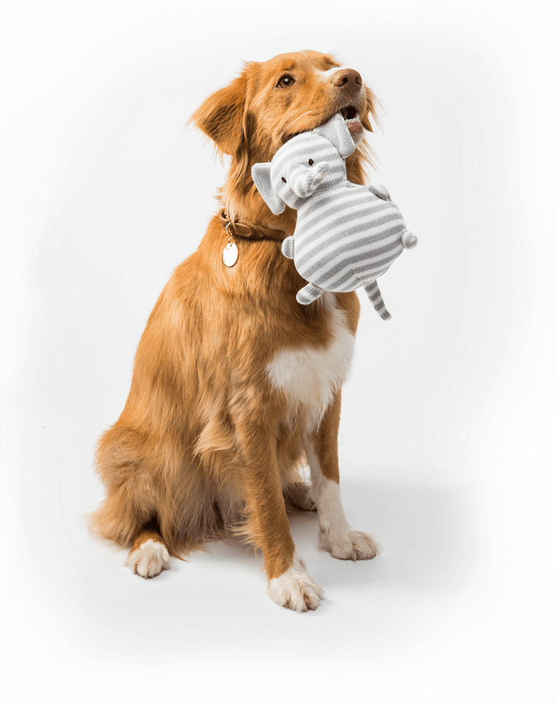
Strut Your Pup
StrutYourPup is the largest daycare provider for dogs in Guttenberg NJ, which is located in the heart of the most densely populated area of the United States. Lots of people living around here have dogs and lots of those dogs are regulars at StrutYourPup.
ROLE
UI/UX designer, UX researcher
DURATION
August 2020 - October 2020
The majority of the clients avoid using the old website, which requires too much browsing and clicking, so instead, they prefer to drop off their pets every morning and pay on site. But in 2020, StrutYourPup temporarily lost 85% of the clients due to massive lay-offs in the Hudson county, which essentially resulted in people staying home and not needing daycare for their pets. StrutYourPup, too, had to let go 60% of the staff.
Overview
Problem
Difficulty in booking daycare services online
Solution
Designing a responsive website to help optimize the booking process
To guide the community towards online booking by addressing the fact that it is faster this way now
GOAL
I really wanted to visit the doggy daycare and interviews dog parents there. But a huge problem was COVID-19 and the lockdown. In person interviews were not an option. I tackled this by emailing the business owner and asking him to pass on my interview invite to 10 of his regular customers. Some of them, I interviewed by Zoom and some I emailed my questions to.
Research
According to the survey, an average client of Strut Your Pup brings their dog to daycare 1.8 times a week. 60% of the clients always plan their visits. 20% come spontaneously and 20% do both. At the same time, 20% book a spot online, 40% walk-in and 40% do both. Finally, 80% pay for daycare with a credit card, 10% pay cash and 10% do both. 50% drive there and 50% walk.
KEY FINDINGS
✓ 10 interviews
✓ 30-50 y.o.
✓ male+female
✓ Guttenberg, NJ
Interview process
I tackled this by emailing the business owner and asking him to pass on my interview invite to 10 of his regular customers. Some of them, I interviewed by Zoom and some I emailed my questions to.
"I like the idea of Rover where you can do everything online. If I want to book anything from SYP, I need to do the first part online and then call them to confirm. For me it's easier just to drop in"

Bugs, typos and misaligned elements make the website feel unsafe to make payments.
Our goal is going to be redesigning the website in such a way that users feel like everything is safe and predictable.
Our goal is going to be redesigning the website in such a way that users feel like everything is safe and predictable.
Pain Point #1
Pain Point #2
Users keep forgetting where to look for different information and have to click too much to find it.
Our priority here will be working out a clear site map and pay more attention to accessibility.
Our priority here will be working out a clear site map and pay more attention to accessibility.
Pain Point #3
On mobile, the website opens weirdly. Absolutely not user friendly.
We are going to make sure we meet our client’s customers’ needs by designing a responsive website that is nice and easy to browse from different devices.
We are going to make sure we meet our client’s customers’ needs by designing a responsive website that is nice and easy to browse from different devices.
Pain Point #4
When logging in, it feels like a dog owner for them is just another customer.
We will make sure to add a personal touch to some parts of the website.
We will make sure to add a personal touch to some parts of the website.


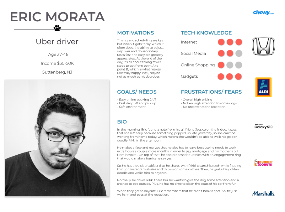
User Persona
USER PERSONA
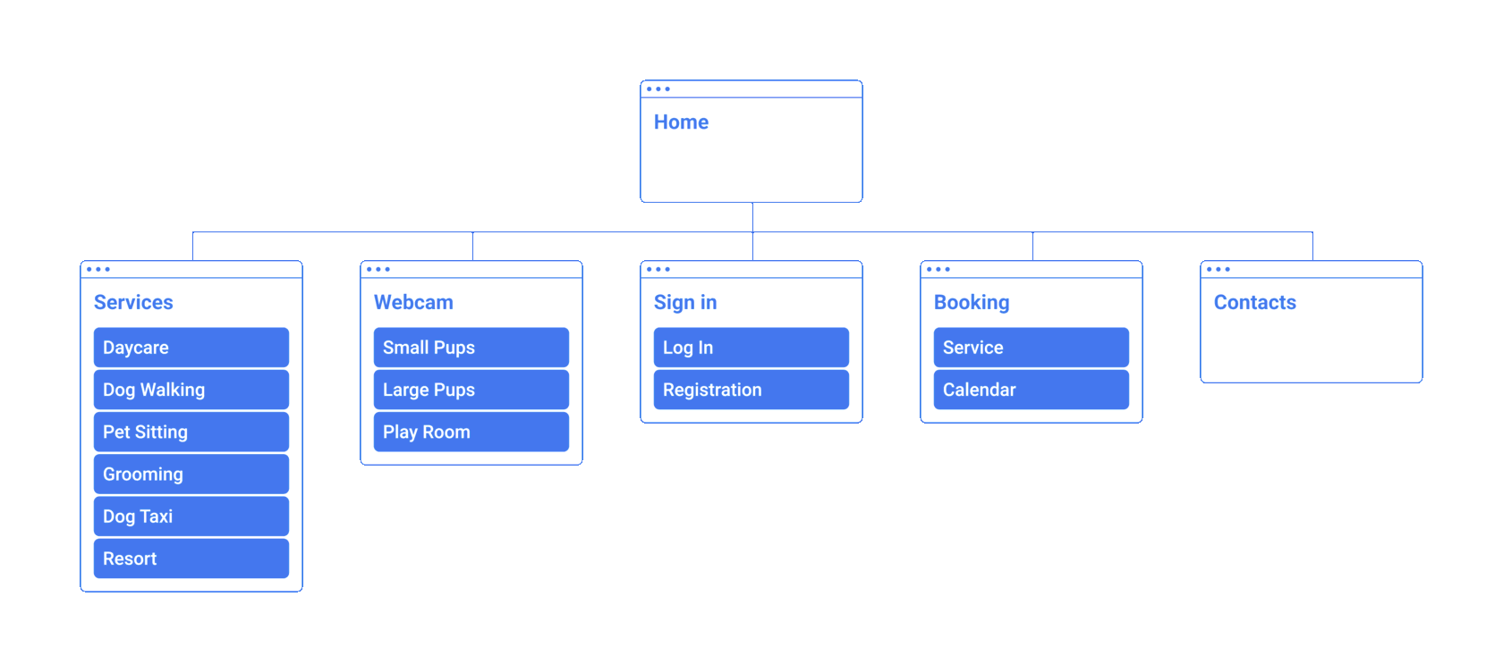
The main challenge in building the site map was trying to squeeze in a lot of information equally important for returning customers, first-timers and even potential clients of the daycare, while keeping it simple, organized and trustworthy.
All in all, the goal was to make every bit of information and any service reachable within a few predictable clicks.
In order to achieve it, I decided to keep the home page as clear as possible, with only 3 options that customers need most: services, booking and webcam + the basic log in and sign up.
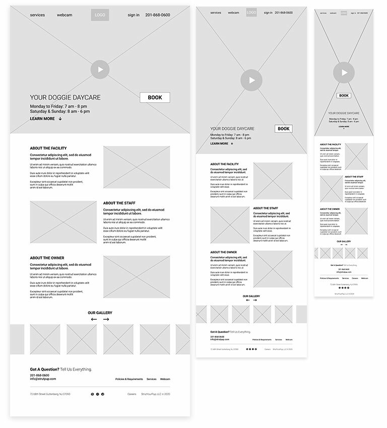
Sitemap
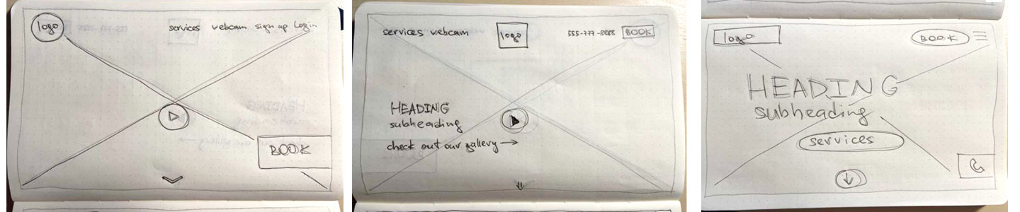
Even after cutting down the amount of information on the home page in
my previous steps, there was still quite a lot of it to work with. Keeping in mind that wrong hierarchy would ruin everything, I decided to resort to using the Z-pattern layout in order to distribute all elements properly.
And to make it less official and more casual, while also keeping in mind the nature of my client’s business, I placed a full-screen video with (duh) happy dogs in the middle of it. Neat and noticable CTA became the icing on the cake at that point.
Here, I cranked up my decade-long copywriting expertise to 110% to revise the volumes provided by the client, so that thick paragraphs
would turn into thin lines and long sentences into short phrases.
I gave just enough information for customers to become interested and want to schedule a Meet & Greet.
As for all the white space I gained, I decided to use it for more photographs of happy dogs. There just can’t be too many of those :)
Wireframes

Usability Study
In order to test my low-fidelity prototype I first reached out to some of the daycare customers I’d interviewed during my research. Unfortunately, none of them succeeded in completing a single task for various reasons.
But before I pronounced the whole endeavor a failure, I realized that perhaps my audience wasn’t exactly ready to get familiar with the software. That also reiterated why they don’t trust the old website and prefer walk-in.
Thus I got a clearer portrait of the audience and went on to test the prototype somewhere else (reddit)
- drop-down menus are too small
- packages page is too clattered
- webcam page has too small a screen
- homepage needs some more space below
- packages page is too clattered
- webcam page has too small a screen
- homepage needs some more space below
KEY FINDINGS
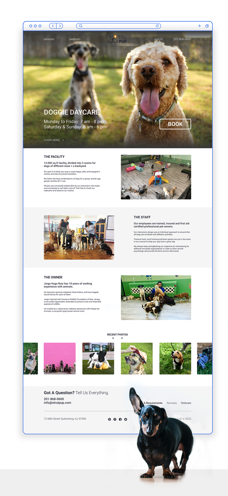
When I finally added some colors to my design, the amount of information inevitably grew bigger, which spurred me on to reconsider the impact of some elements in order to improve
usability.
For example, I lost the video on the homepage and put a photo of nice dogs there instead. This decision was made because videos are generally too loud and distracting, especially when CTA’s and other important elements are place above it.
Also, a video would make the website heavier and that’s the opposite of our goal, when we talk about customers who often have to use the website on the go.
User Flow

Takeaways
The biggest challenge on this project was designing for users who try to avoid using websites that require money transactions. Especially when some of those users don’t speak English very well, which I learned at the very end of the gig. Which is now something I would address first of all in the next steps.
So, I guess the first lesson I learned was that collecting data doesn’t end when research does. Perhaps, next time I’m doing my research I’m going to touch base on some of the basics I used to take for granted. Like what is the users’ first language.
I was happy to find out that the stakeholders found my vision of the new website a lot more accessible and clear. It was a pleasure to hear how they lost track of time browsing different pages even though they new by heart all the information already.